


Table of Contents
Hello friends, Web design has a long history. Today, Aspire brings a well-known blog post on ‘CSS Flexbox’.
For a long decade, Floats and Positioning are the only reliable cross-browser-compatible tools for creating CSS layouts. These are good and helpful, but they are also rather limited and complex when implementing.
Prerequisites:
- HTML basics (study Introduction to HTML)
- CSS basics (study Introduction to CSS.)
What is Flexbox:
As per Mozilla, Flexbox is known as a one-dimensional layout method for placing items in rows or columns.
You can watch CSS Flexbox in video format, if you like the video, please do like, share, and subscribe to our channel.
This article explains all the fundamentals.
The flex model
In the flex model, When elements are arranged as flex items, they are arranged along the main axis and cross axis.
In the below image, basic concepts are showed as cross-start, cross-end, main-start and, main-end.
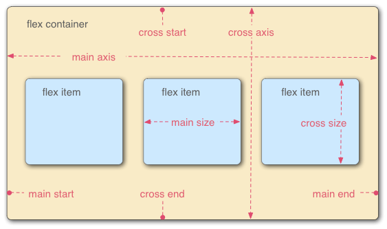
A flexbox container has two axes:
- main axis
- cross-axis
The main axis:
The main axis is defined by the value of the flex-direction property. The main axis generally can go from any below directions:
- left to right : flex-direction: row
- right to left : flex-direction: row-reverse
- top to bottom : flex-direction: column
- bottom to top : flex-direction: column-reverse
The cross axis:
The cross axis is defined by the start & end of the axis which is running perpendicular to the direction the flex items are arranged.
The start and end of the axis are called the cross start and cross end.
Browser Support – CSS Flexbox
The flexbox is majorly supported in all modern browsers. (For detailed information here )
Example: Chrome:29.0, IE:11.0, Mozilla:22.0, Safari:10, Opera:48
How to use Flexbox?
To use the Flexbox model, you require to name the container div by setting the display property to flex.
The flex container is considered the parent element.
Example:
<style>
.container {
   display: flex;
}
</style>
<div class="container">
<div>1</div>
<div>2</div>
<div>3</div>
<div>4</div>
<div>5</div>
<div>6</div>
</div>
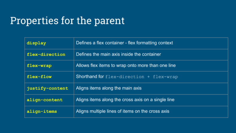
Flexbox properties are categorized into two parts as below:
- Parent properties:
- Children properties
1. Flexbox Parent properties:
Below are the main flex container properties:
- Flexbox flex-direction
- Flexbox flex-wrap
- Flexbox flex-flow
- Flexbox justify-content
- Flexbox align-content
- Flexbox align-items
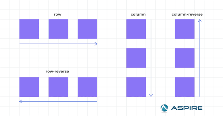
1. Flexbox flex-direction:
The flex-direction property defines the direction where the container arranges the flex items.
The below points are as below:
1.1 Flex Direction – row
1.2 Flex Direction – row-reverse
1.3 Flex Direction – column
1.4 Flex Direction – column-reverse
Syntax:
.wrapper {
    flex-direction: row || row-reverse || column || column-reverse;
}
1.1 Flex Direction – row
The Flex Direction’s row value arrange the flex items horizontally (from left to right):
.flex-container {
  display: flex;
  flex-direction: row;}
1.2. Flex Direction – row-reverse
The Flex Direction’s row-reverse value arranges the flex items horizontally (but from right to left):
.flex-container {
  display: flex;
  flex-direction: row-reverse;}
1.3 Flex Direction – column
Flex Direction’s column value stacks the flex items vertically(from top to bottom):
.flex-container {
display: flex;
  flex-direction: column;}
1.4 Flex Direction – column-reverse
The column-reverse value stacks the flex items vertically (but from bottom to top):
.flex-container {
  display: flex;
  flex-direction: column-reverse;}
Output:
2. Flexbox flex-wrap
The Flexbox flex-wrap property specifies whether the flex items are compulsory in a single line or multiple lines. If the flex-wrap property sets to multiple lines, it also defines the cross-axis, determining the direction new lines are placed in.
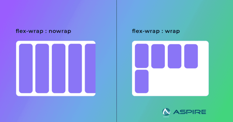
The below properties are as below:
- Flex Wrap – wrap
- Flex Wrap – nowrap
- Flex Wrap – wrap-reverse
Syntax:
.wrapper{
   flex-wrap: wrap | nowrap | wrap-reverse;
}
2.1 Flex Wrap – Wrap
The Flex Wrap’s wrap value specifies that the flex items will wrap into multiple rows or columns, depending on flex-direction. The default value is nowrap.
.flex-container {
  display: flex;
  flex-wrap: wrap
}
2.2 Flex Wrap – nowrap(default):
The Flex Wrap’s nowrap value specifies that the flex items will not wrap (this is the default):
.flex-container {
  display: flex;
  flex-wrap: nowrap;
}
2.3 Flex Wrap – wrap-reverse:
The Flex Wrap’s wrap-reverse value defines that the flexible items will wrap in the reverse order.
.flex-container {
  display: flex;
  flex-wrap: wrap-reverse;
}
Example:
3. Flexbox flex-flow
The flex-flow property is known as a shorthand property for setting both the flex-direction & flex-wrap properties.
3.1 Flex Flow – row wrap
Syntax:
.flex-container {
  display: flex;
  flex-flow: row|column|row-reverse|column-reverse|nowrap|wrap|wrap-reverse|
row nowrap|row wrap|column wrap|column nowrap|column-reverse wrap-reverse;
}
Working Example:
4. Flexbox justify-content
Flexbox justify-content is used to define the space to align the items horizontally.
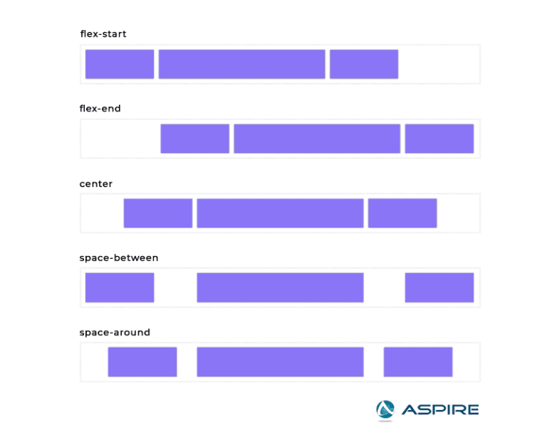
The below points are as below:
- Justify Content – center
- Justify Content – flex-start
- Justify Content – flex-end
- Justify Content – space-around
- Justify Content – space-between
Syntax:
.wrapper {
justify-content: normal|stretch|center|start|end|flex-start|flex-end|baseline|space-between|space-around|space-evenly|left||right
}
4.1 Justify Content – center
Justify Content’s center value is used to align the flex items at the center of the container:
.flex-container {
  display: flex;
  justify-content: center;
}
4.2 Justify Content – flex-start
The Justify Content’s flex-start value is used to align the flex items at the starting of the container (default):
Code:
.flex-container {
  display: flex;
  justify-content: flex-start;
}
4.3 Justify Content – flex-end
The flex-end value aligns the flex items at the end of the container:
.flex-container {
  display: flex;
  justify-content: flex-end;
}
4.4 Justify Content – space-around
The Justify Content’s space-around is used to display the flex items with space before, between, and after the lines.
.flex-container {
  display: flex;
  justify-content: space-around;
}
4.5 Justify Content – space-between
The Justify Content’s space-between is used to display the flex items with space between the lines:
.flex-container {
  display: flex;
  justify-content: space-between;
}
4.6 Justify Content – space-evenly
The Justify Content’s space-evenly is used to display the flex items with space evenly distributed among the flex elements.
.flex-container {
  display: flex;
  justify-content: space-evenly;
}
Output:
5. Flexbox align-items
The CSS align-items property defines the align-self value on all direct children as a group. Flexbox controls the alignment of items on the Cross Axis.
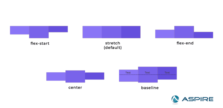
The below points are as below:
- align-items – center
- align-items – flex-start
- align-items – flex-end
- align-items – space-around
- align-items – space-between
Syntax:
.wrapper {
    align-items: baseline | center | flex-start | flex-end | stretch;
}
5.1 align-items – center
The align-items’s center is used to align the flex items in the middle of the container.
Code:
.flex-container {
  display: flex;
  height: 200px;
  align-items: center;
}
5.2 align-items – flex-start
The align-items – flex-start is used to align the flex items at the top of the container:
Code:
.flex-container {
  display: flex;
  height: 200px;
  align-items: flex-start;
}
5.3 align-items – flex-end
The align-items’s flex-end is used to align the flex items at the bottom of the container.
.flex-container {
  display: flex;
  height: 200px;
  align-items: flex-end;
}
5.4 align-items – stretch
The align-items’s stretch is used to stretch the flex items to fill the container. (default):
.flex-container {
  display: flex;
  height: 200px;
  align-items: stretch;
}
5.5 align-items – baseline
The align-items’s baseline is used to align the flex items such as their baselines align.
Code:
.flex-container {
  display: flex;
  height: 200px;
  align-items: baseline;
}
Example:
6. Flexbox align-content:
The Flexbox’s align-content property is used to align the flex lines.
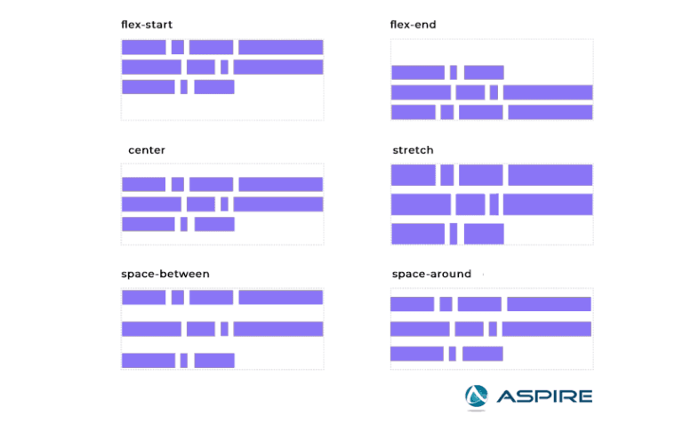
The below points are as below:
-
- align-content – space-between
- align-content – space-around
- align-content – stretch
- align-content – center
- align-content – flex-start
- align-content – flex-end
Syntax: stretch
.wrapper {
    align-content: initial |stretch|center|flex-start|flex-end|space-between|space-around;
}
6.1 align-content – space-between
The align-content’s space-between is used to display the flex lines with equal space between them:
.flex-container {
  display: flex;
  height: 600px;
  flex-wrap: wrap;
  align-content: space-between;
}
6.2 align-content – space-around
The align-content’s space-around is used to display the flex lines with space before, between, and after them.
.flex-container {
  display: flex;
  height: 600px;
  flex-wrap: wrap;
  align-content: space-around;
}
6.3 align-content – stretch
The align-content’s stretch is used to stretch the flex lines to take up the remaining space (default):
.flex-container {
  display: flex;
  height: 600px;
  flex-wrap: wrap;
  align-content: stretch;
}
6.4 align-content – center
The align-content’s center is used to display the flex lines in the middle of the container.
.flex-container {
  display: flex;
  height: 600px;
  flex-wrap: wrap;
  align-content: center;
}
6.5 align-content – flex-start
The align-content’s flex-start is used to display the flex lines at the start of the container.
.flex-container {
  display: flex;
  height: 600px;
  flex-wrap: wrap;
  align-content: flex-start;
}
6.5 align-content – flex-end
The align-content’s flex-end is used to display the flex lines at the end of the container.
.flex-container {
  display: flex;
  height: 600px;
  flex-wrap: wrap;
  align-content: flex-end;
}
Example:
Children Properties:
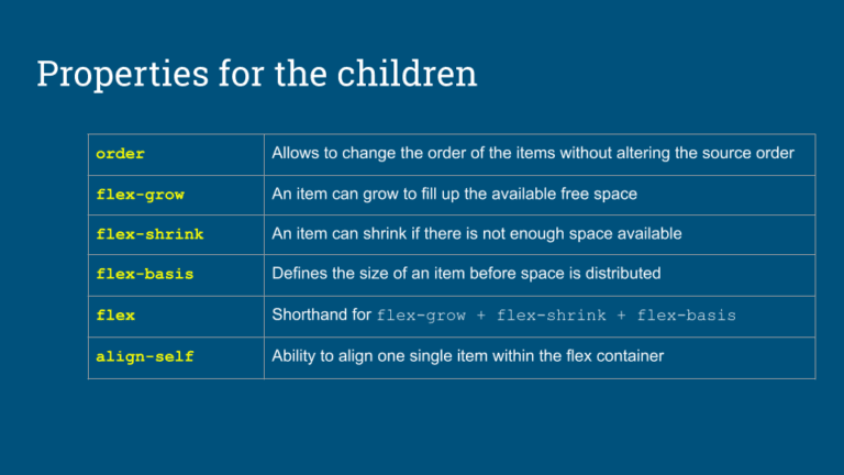
1. order:
The order CSS property defines the order to arrange an item in a flex or
grid container. Items in a container are generally sorted by ascending order
and by their source code order.
Syntax: order: number | 0
.item {
  order: 4; // default value is 0
}
2. flex:
Shorthand for flex-grow + flex-shrink + flex-basis.
The flex property
is used as a shorthand property for the flex-grow, flex-shrink, and
flex-basis properties.
Syntax: flex-grow flex-shrink flex-basis|auto|initial|inherit;
/* Keyword values */ flex: auto; flex: initial; flex: none;/* One value, unitless number: */ flex: 2;
/* One value, width/height: flex-basis */ flex: 10em; flex: 30%; flex: min-content;
/* Two values: flex-grow | flex-basis */ flex: 1 30px;
/* Two values: flex-grow | flex-shrink */ flex: 2 2;
/* Three values: flex-grow | flex-shrink | flex-basis */ flex: 2 2 10%;
3. flex-grow:
The flex-grow property is used to define the size of how much a flex item will grow relative to the rest of the flex items.
Syntax: flex-grow: number | 0;
.flex-item {
   flex-grow: 4; // default is 0
}
4. flex-shrink:
The flex-shrink property is used to the ability for a flex item to
shrink.
The flex-shrink property is used to define size the how much a
flex item will shrink relative to the rest of the flex items.
Syntax: flex-shrink: number | 0;
Example:
.flex-shrink {
   flex-shrink: 2; // default is 0
}
5. flex-basis:
The flex-basis is used to define the size of an item before space is
distributed.
The flex-basis property specifies the initial length of a
flex item.
Syntax: flex-basis: number|auto|initial|inherit;
.flex-basis {
   flex-basis: 4; // default is 0
}
6. align-self:
The flex-basis is used to align one single item within the flex
container.
The align-self property overrides the default alignment
which is defined by the container’s align-items property.
Syntax: align-self: number|auto|initial|inherit;
.align-self {
    align-self: auto | flex-start | flex-end | center | baseline | stretch;
  }
Output:
Conclusion
As we have seen Spectator with Angular testing using Spectator. We have seen mocking components using. Ready to explore more and enhance your Angular testing skills? Contact us and take your testing to the next level!


