


Hello Leaders, Welcome to Aspire SoftServ Pvt. Ltd (formerly known as Aspire Software Solutions), We are introducing the Tailwind CSS series.
Table of Contents
If you are a beginner in Tailwind CSS, please follow our series as below:
The Complete Guide of TailwindCSS [ COMPLETE SERIES ]
What is Tailwind CSS
TailwindCSS is a utility-first CSS framework that makes it easy to implement popular design patterns. It is also the only framework that follows the Utility-First CSS methodology, which means your code can be more organized, reusable, and extensible.
CUSTOMIZATION in Tailwind CSS
Tailwind CSS provides powerful features to create and customize the best industrial-level web design with smart tools.
Advantages of Customization in Tailwind CSS
Customization is very important in web design. Customization in tailwind CSS has many affecting advantages below is the list:
- Customization should be Fast and Effective
- Customization should be less time-consuming, resources and cost
- Customization should be hassle-free for developers.
- Customization should be reliable when
We can do customization in Tailwind CSS as below:
- Configuration
- Just-in-Time Mode
- Theme
- Breakpoints
- Colors
- Spacing
- Variants
- Plugins
- Presets
Configuration
Tailwind CSS uses a default configuration file (tailwind.config.js) for any customization purposes.
By default, Tailwind will explore an optional tailwind.config.js file at the root of your project where you can place any customizations.
How to Create Tailwind CSS configuration file
If you are working and installed Tailwind CSS using NPM. First, Generate a Tailwind configuration file for your project using the Tailwind CLI utility used when you want to install the tailwindcss npm package:
npx tailwindcss init // for minimum & default configuration (recommended)npx tailwindcss init --full // for full complete configuration optionsOutput generated file:
module.exports = {
    purge: [],
    darkMode: false, // or  'class' or 'media'
    theme: {
      extend: {},
    },
    variants: {
      extend: {},
    },
    plugins: [],
  }
Here, the theme is used for display, and layout comparison changes are covered here like various spacing, sizing, and colors. You can read in the upcoming articles.
Just-in-Time Mode
Tailwind CSS v2.1 introduced a new feature just-in-time compiler for Tailwind CSS that generates your styles on-demand instead of generating everything in advance at the initial build time.
Advantages of Just-in-time Mode:
- Lightning-fast build times. Tailwind’s build process usually uses 3–8s to initially compile using CLI, and upwards of 30–45s in webpack projects
- Every variant is enabled out of the box. Variants like active, disabled, focus-visible, and others are not enabled by default due to file-size considerations.
Enabling JIT mode: To enable just-in-time mode, set the mode to ‘jit’ in your tailwind.config.js file. This feature is in Preview mode.
 // tailwind.config.js
    module.exports = {
     mode: 'jit',
      purge: [
        // ...
      ],
      theme: {
        // ...
      }
      // ...
    }
Theme
The theme section of your tailwind.config.js file is where you define your project’s color palette, font, type scale, breakpoints, border-radius values, and more.
The theme object includes keys for colors, screens, and spacing, as well as a key for each customizable core plugin.
- Colors: The colors key provides you to modify the global color palette for your project.
- Screens: The screens key provides you to modify the responsive breakpoints in your project.
- Spacing: The spacing key provides you to modify the global spacing and sizing scale for your project.
- Extend: If you’d like to save the default values for a theme option simply also add new values, and add your extensions under the extend key in the theme section of your configuration file.
For example, if you need to add an extra breakpoint but want to save the existing ones, then you can extend the screen property as below. Below is the sample file of the tailwind config file in which we can extend the theme, colours, font-family, and a lot of options.
Example of tailwind.config.js
// tailwind.config.js
  const colors = require('tailwindcss/colors')
module.exports = {
theme: {
screens: {
sm: '480px',
md: '768px',
lg: '976px',
xl: '1440px',
},
colors: {
gray: colors.coolGray,
blue: colors.lightBlue,
red: colors.rose,
pink: colors.fuchsia,
},
fontFamily: {
sans: ['Graphik', 'sans-serif'],
serif: ['Merriweather', 'serif'],
},
extend: {
spacing: {
'128': '32rem',
'144': '36rem',
},
borderRadius: {
'4xl': '2rem',
}
}
}
}
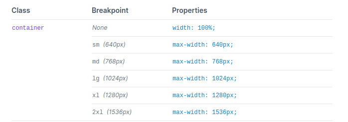
Breakpoints
The default breakpoints are inspired by common device resolutions: For more information read the documentation.
// tailwind.config.js
module.exports = {
theme: {
screens: {
'sm': '640px', // @media (min-width: 640px) { ... }
'md': '768px'  // @media (min-width: 768px) { ... }
'lg': '1024px',  // @media (min-width: 1024px) { ... }
'xl': '1280px', // @media (min-width: 1280px) { ... }
'2xl': '1536px', // @media (min-width: 1536px) { ... }
}
}
}
Colors
Tailwind introduces an expertly crafted default color palette out-of-the-box that is an excellent starting point. You don’t
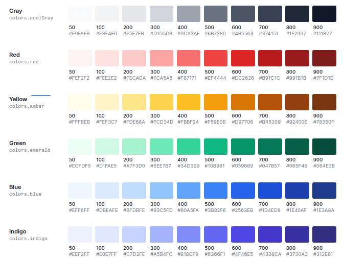
You can read more about it in the tailwind CSS color documentation.
Spacing
Spacing in Tailwind CSS provides developers and designers to customize existing spacing. Use the spacing key to customize Tailwind’s default spacing/sizing scale in the theme section in the tailwind.config.js file.
// tailwind.config.js
module.exports = {
theme: {
spacing: {
'1': '8px',
'2': '12px',
'3': '16px',
'4': '24px',
'5': '32px',
'6': '48px',
}
}
}
Variants
The variants division of your tailwind.config.js file is where you manage which variants should be enabled for specific core plugins:
// tailwind.config.js
module.exports = {
variants: {
extend: {
backgroundColor: ['active'],
// ...
borderColor: ['focus-visible', 'first'],
// ...
textColor: ['visited'],
}
},
}
Plugins
Extending Tailwind with reusable third-party plugins.
// tailwind.config.js
const plugin = require('tailwindcss/plugin')
module.exports = {
plugins: [
plugin(function({ addUtilities, addComponents, e, prefix, config }) {
// Add your custom styles here
}),
]
}
To get started with your initial plugin, import Tailwind’s plugin function from tailwindcss/plugin. Then inside your plugin’s array, and as the first argument call it with an anonymous function.
Presets
Creating your reusable configuration presets.
By default, any configuration you add in your tailwind.config.js file is well merged with the default configuration, with your configuration representing a set of overrides and extensions.
The presets option enables you to define a different configuration to use as your base, creating it simple to package up a set of customizations that you’d prefer to reuse across projects.
// tailwind.config.js
module.exports = {
presets: [
require('@acmecorp/tailwind-base')
],
// ...
}
LAYOUT
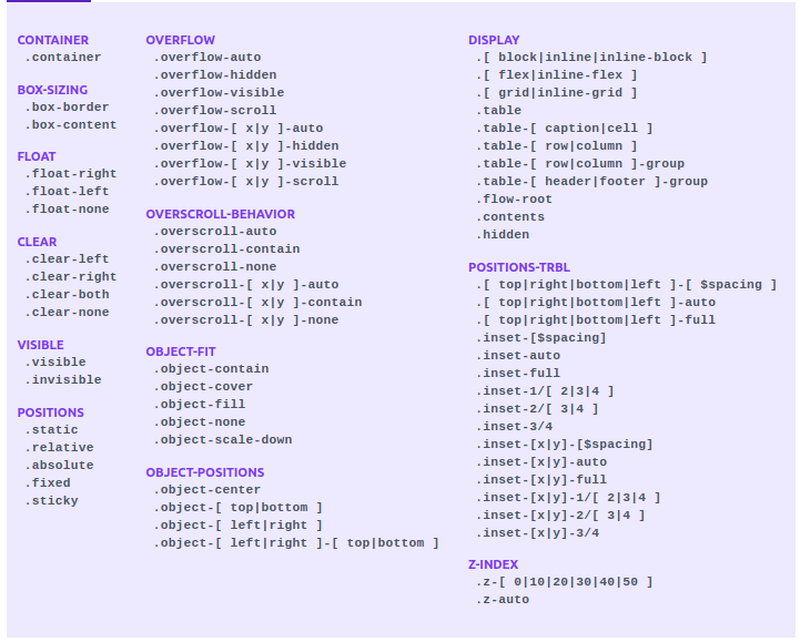
Reference: Reddit
Container
What is Container: Container is used to arrange components are arranged aligned in the
Syntax:
Usage:
- To center a container, use the utility class – mx-auto:
<div class="container mx-auto">
<!-- ... →
</div>- To add horizontal padding, use the px-{size} utilities:
<div class="container mx-auto px-4">
<!-- ... -->
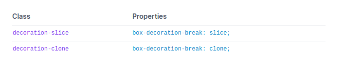
</div>Box Decoration Break
What: Box Decoration BreakTailwind CSS version
Utilities for managing how element fragments should be rendered across columns, multiple lines, or pages.
Syntax:
Code:
<div class="decoration-clone md:decoration-slice bg-gradient-to-b from-blue-400 to-blue-200 text-transparent">
<br>
</div>
Example:
Box Sizing:
What: Utilities for managing how the browser should determine an element’s total size.
There are two kinds of box-sizing in tailwindcss.
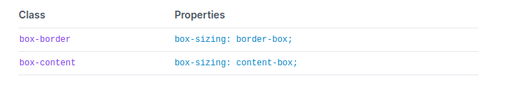
Why:
Use box-border to set an element’s box-sizing to border-box, instructing the browser to add the element’s borders and padding when you give it a height or width.
Code:
<div class="box-border h-32 w-32 p-4 border-4 ...">
<!-- ... -->
</div>
Example:

Display
The display property is used for utilities for controlling the display box type of an element.
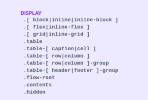
There are mainly 5 types of display elements used.
1. Block
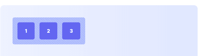
Use the ‘block’ utility class to create a block-level element.
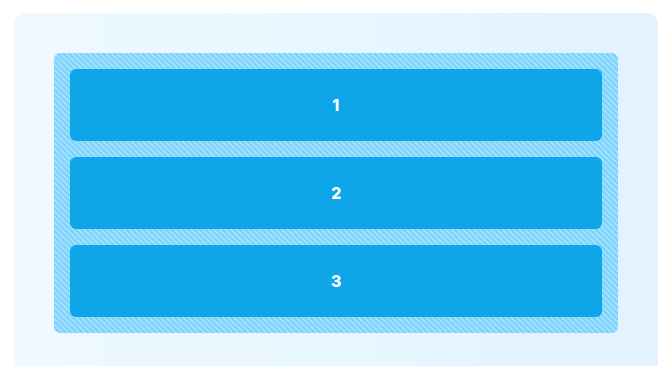
Code
<div class="space-y-4">
<span class="block">1</span>
<span class="block">2</span>
<span class="block">3</span>
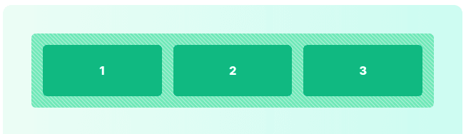
</div>2. inline-block
Use inline-block to create an inline block-level element.
Code
<div class="space-x-4 ...">
<div class="inline-block ...">1</div>
<div class="inline-block ...">2</div>
<div class="inline-block ...">3</div>
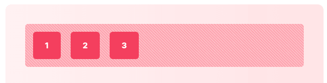
</div>3. inline
Use inline to create an inline element.
Code
<div>
<div class="inline ...">1</div>
<div class="inline ...">2</div>
<div class="inline ...">3</div>
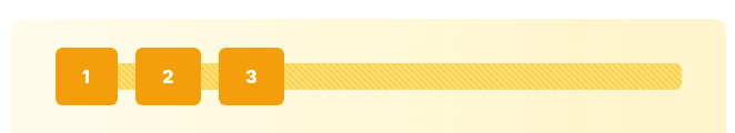
</div>4. flex
Flex is used to generate a block-level flex container.
Code
<div class="flex space-x-4 ...">
<div class="flex-1 ...">1</div>
<div class="flex-1 ...">2</div>
<div class="flex-1 ...">3</div>
</div>
5. inline-flex
Inline-flex is useful to generate an inline flex container.
Code
<div class="inline-flex space-x-4 ...">
<div class="flex-1 ...">1</div>
<div class="flex-1 ...">2</div>
<div class="flex-1 ...">3</div>
</div>
6. Grid
Use the grid to create a grid container.
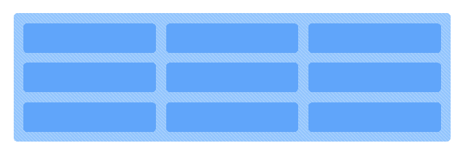
Code
<div class="grid gap-4 grid-cols-4">
<div class="flex-1 ...">1</div>
<div class="flex-1 ...">2</div>
<div class="flex-1 ...">3</div>
</div>
7. table
Use the table, .table-cell, .table-row, .table-caption, .table-column, .table-column-group, table-row-group, .table-header-group, and .table-footer-group utilities to create elements that behave like their respective table elements.
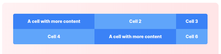
Code
<div class="table w-full ...">
<div class="table-row-group">
<div class="table-row">
<div class="table-cell ...">A cell with more content</div>
<div class="table-cell ...">Cell 2</div>
<div class="table-cell ...">Cell 3</div>
</div>
<div class="table-row">
<div class="table-cell ...">Cell 4</div>
<div class="table-cell ...">A cell with more content</div>
<div class="table-cell ...">Cell 6</div>
</div>
</div>
</div>
Floats
Float is a utility to control the wrapping of content around an element.
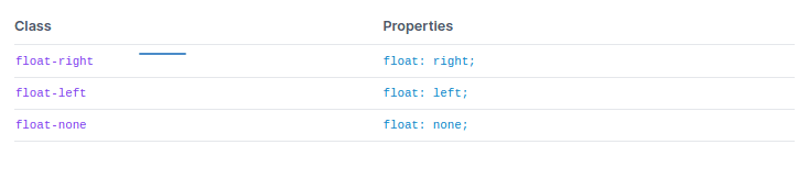
Code:
<div class="bg-gray-200 p-4">
<img src=".." class="float-right md:float-left">
<p> Lorem ipsum...</p>
</div>
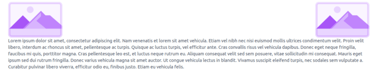
</div>Clear
Clear is a Utility for managing the wrapping of content around an element.
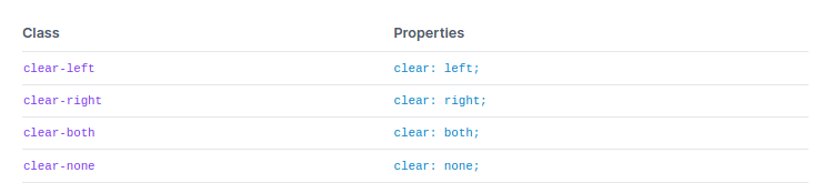
Code
<div class="container mx-auto">
<img class="float-left" src="https://tailwindcss.com/img/placeholder-purple.svg">
<img class="float-right" src="https://tailwindcss.com/img/placeholder-purple.svg">
<p class="clear-left">Lorem ipsum ...</p>
</div>
Example
Isolation
Isolation is a Utility for managing whether an element should explicitly create a new stacking context.
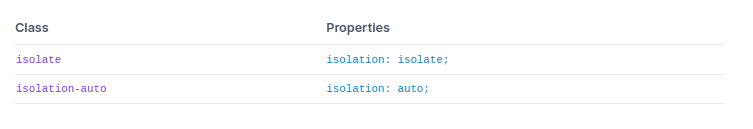
Code
Isolate in Tailwind CSS presents two options – isolate and isolation-auto
isolate: it preserves the element from blending into different elements that are in the backdrop.
auto: it resets the isolation and presents the element to blend into its backdrop.
<div class="isolate ...">
<!-- ... -->
</div>
Output
With isolate

With Isolate auto

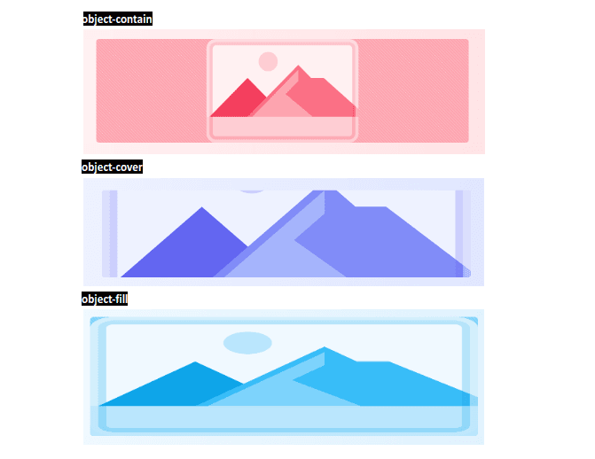
Object Fit
Object Fit is a Utility for managing how a replaced element’s content should be resized.
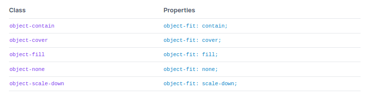
Code
<div class="bg-rose-300">
<img class="object-contain h-28 my-5 w-full" src="https://tailwindcss.com/img/placeholder-purple.svg">
<img class="object-cover h-28 my-5 w-full" src="https://tailwindcss.com/img/placeholder-purple.svg">
<img class="object-fill h-28 my-5 w-full" src="https://tailwindcss.com/img/placeholder-purple.svg">
</div>
Example
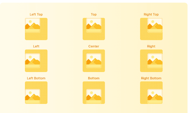
Object Position
Utilities for managing how a replaced element’s content should be placed within its container.
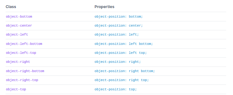
Code
<img class="object-none object-left-top bg-yellow-300 w-24 h-24 ..." src="...">
<img class="object-none object-top bg-yellow-300 w-24 h-24 ..." src="...">
<img class="object-none object-right-top bg-yellow-300 w-24 h-24 ..." src="...">
<img class="object-none object-left bg-yellow-300 w-24 h-24 ..." src="...">
<img class="object-none object-center bg-yellow-300 w-24 h-24 ..." src="...">
<img class="object-none object-right bg-yellow-300 w-24 h-24 ..." src="...">
<img class="object-none object-left-bottom bg-yellow-300 w-24 h-24 ..." src="...">
<img class="object-none object-bottom bg-yellow-300 w-24 h-24 ..." src="...">
<img class="object-none object-right-bottom bg-yellow-300 w-24 h-24 ..." src="...">
Example
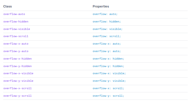
Overflow
Overflow is a Utility for managing how an element handles content that is too large for the container.
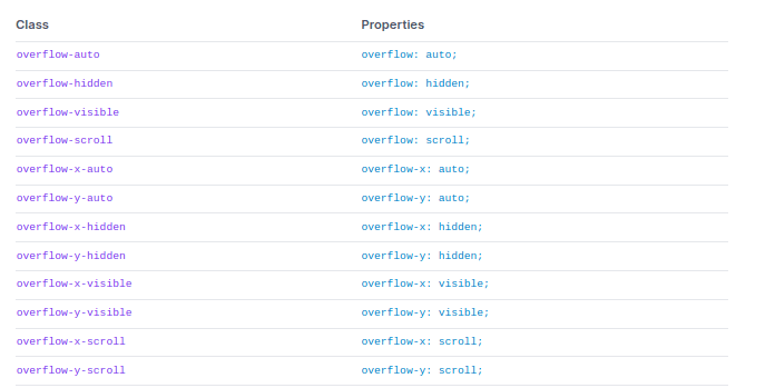
Code
<div class="overflow-scroll ...">Lorem Ipsum</div>
<div class="overflow-visible...">Lorem Ipsum</div>
<div class="overflow-auto ...">Lorem Ipsum</div>
Example
Overscroll Behavior
Overscroll Behavior is a Utility for managing how the browser functions when reaching the boundary of a scrolling region.
Code
<div class="overscroll-auto ...">Lorem ipsum dolor sit amet...</div>Example

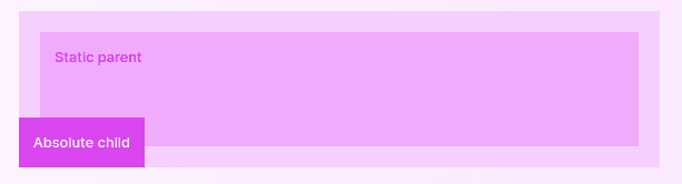
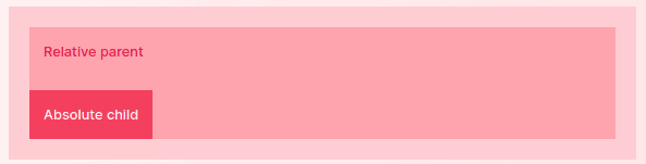
Position
The position is a Utility for managing how an element is positioned in the DOM.
Code
<div class="static ...">
<p>Static parent</p>
<div class="absolute bottom-0 left-0 ...">
<p>Absolute child</p>
</div>
</div>
Example
Top / Right / Bottom / Left
Positional utilities like top/right/bottom/left are for managing the placement of positioned elements.
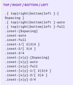
Code
<!-- Span top edge --> <div class="relative h-32 w-32 ..."> <div class="absolute inset-x-0 top-0 h-16 ...">1</div> </div><!-- Span right edge --> <div class="relative h-32 w-32 ..."> <div class="absolute inset-y-0 right-0 w-16 ...">2</div> </div>
<!-- Span bottom edge --> <div class="relative h-32 w-32 ..."> <div class="absolute inset-x-0 bottom-0 h-16 ...">3</div> </div>
<!-- Span left edge --> <div class="relative h-32 w-32 ..."> <div class="absolute inset-y-0 left-0 w-16 ...">4</div> </div>
<!-- Fill entire parent --> <div class="relative h-32 w-32 ..."> <div class="absolute inset-0 ...">5</div> </div>
Example
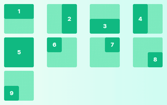
For more information, please visit positions in tailwindcss
Visibility
Visibility is a Utility for managing the visibility of an element.

Invisible: it is useful to hide an element, but still stay in the DOM,
Visible: it is useful to make an element visible.
Code
<div class="my-8 flex justify-center space-x-4">
<div>1</div>
<div class="invisible">2</div>
<div>3</div>
</div>
Example
Z-Index
Z-Index is a utility for managing the stack order of an element. More index numbers, more overlapping to other elements.
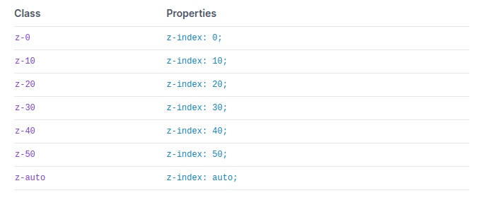
Code
<div class="z-40 ...">5</div>
<div class="z-30 ...">4</div>
<div class="z-20 ...">3</div>
<div class="z-10 ...">2</div>
<div class="z-0 ...">1</div>
Example

Conclusion
Let’s conclude, This post covered all the Tailwind CSS features like layout and customization. We recommended following the complete series in sequential order for better understanding.
You can bookmark this for better understanding and quick reference. You can use documentation to understand any configuration-related changes when you work on any project.
It is recommended to go through each section practically, do the practical, and bookmark the tab. Also, if you have any questions or need further assistance, feel free to Contact us . Don’t forget to share with friends and colleagues on social media.


